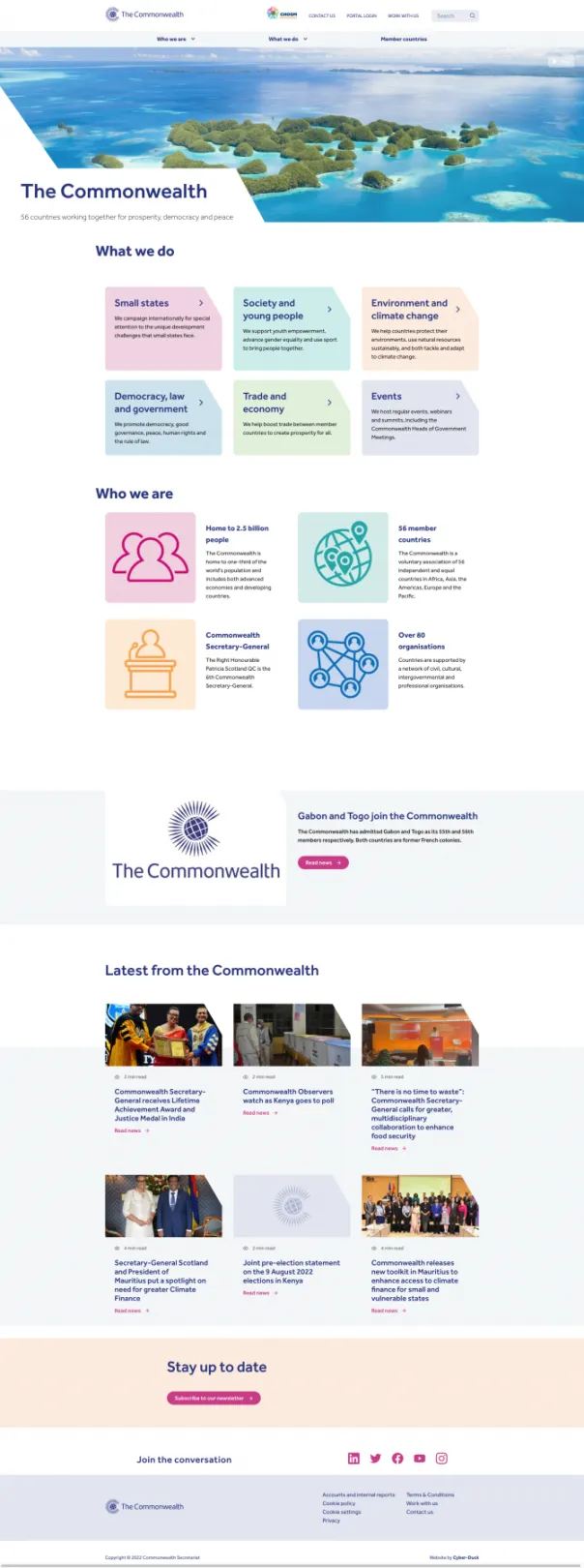
The Commonwealth communicates its priorities online through a group of websites. This structure was logical, given the diversity of their priorities: such as ocean conservation versus electoral democracy.
But the websites were built with different styles, technologies and even their own CMS. This made content governance, creation and promotion impossible; it was difficult to communicate with citizens in a user-friendly and responsive way.
Following a competitive tender and pitching process, Cyber-Duck was chosen to produce a user experience strategy for The Commonwealth.
The Commonwealth has a broad spectrum of users: from Government officials, accessing specialised content with a login; journalists, looking for statistics and reports; to the general public, interested in The Commonwealth’s role.
We ran quantitative surveys with over 100 users to understand the ‘what, where and when’; 10 detailed, qualitative interviews delved into the ‘why and how’. This included users from the UK, all the way to Nigeria, Ghana, Australia, Canada, Bangladesh and India. Together, this built our understanding of the users’ wants, needs and context.
Alongside the Commonwealth staff themselves, we identified three primary user types:
- Official users – Heads of State and Government Officials
- Professional users – Journalists and researchers
- Public users – 2.4 billion citizens, from students to community leaders
From this, we crafted the persona logic and user journeys. We predominantly focused on the Government Official users.
Establishing the accessibility standards for a project of this magnitude was important. We recommended the future website should adhere to The World Wide Web Consortium (W3C) Double AA standard. These standards are followed by other governmental organisations, including GOV.UK. Adhering does even more than benefit people with disabilities; it also improves usability and SEO.
Our UX audit identified the chief challenge: The Commonwealth’s portfolio contained numerous microsites for different departments, alongside its main website.
All too often, these microsites were built by different agencies; so, they didn’t even use the same technologies or CMS. This wasn’t compatible with a cohesive, easily managed digital marketing strategy. Document libraries, archives and a bookstore also joined the microsites.
We could improve the architecture by comparing existing and desired user journeys, based on our new persona and stakeholder research.
Our vision was to create a modular, permission-based architecture with show-and hide-capabilities. This would allow us to personalise and cater for all individuals within a single website.
For example, users should be able to access the same content, either through country pages or the innovation section. Simultaneously, they should be able to toggle (or select) what type of content they want, whether professional or public.
We analysed the existing digital portfolio and web systems and recommended the following website architecture and sitemap:
- Main public-facing website – exploring the member states, the Commonwealth’s role, statistics and stories.
- Professional parallel websites – containing reports and technical data researched by The Commonwealth
- Gated area – reserved for Government officials, searching for information relevant to their roles.
We analysed the mobile performance, page speed, duplicate content, structured data, canonical tags, URL structure, redirect chains and even things like pagination and broken links.
Content duplication was one of the key items we highlighted, across the main website and microsites. We addressed this as a ‘quick fix’ and in the long-term, as part of the content strategy.
For The Commonwealth’s future web project, we taught the team to create a data capture plan that highlights how the KPIs/OKRs and goals will be tracked and what type of reporting tools will be used.
The Marketing & Communication team cared deeply about their position in the rankings related to The Commonwealth. Cyber-Duck advised how optimising for featured and rich snippets could increase their potential; once created, it becomes easier to become an authority for Conversational UI (CUI) devices like Google Home and even Amazon Alexa.
About the project
Our objectives were to:
- Create a data-driven UX strategy that distilled and prioritised the key personas for communications.
- Draw a new website and technical architecture that could guide the structure and purpose for the website group.
- Produce a content strategy, editorial and governance guidelines that could support the communication aims.
- Underpin all work with search engine optimisation and analytics, so citizens could find and access content faster.
Why Drupal was chosen
We used Drupal as the primary CMS due to its flexibility, stability and user friendliness so the various stakeholders at The Commonwealth could easily add and edit content on the fly. Another reason for using Drupal was its SEO optimised nature to parse content and URL so they can easily get indexed by search engines. We also used Drupal due to its ability to generate accessible content 'out of the box'.
Technical Specifications
Drupal version: