Turn any blocks, views, forms or anything with CSS selectors into popup.
It will not require any special library or coding skills. The main difference between other popups like colorbox, lightbox, modal popup and Simple Popup Blocks are providing configuration to choose the layouts and other dynamic options.
It provides 10 different layouts with and without overlay. Below we added sample popup lists which will utilize the popup with and without overlay.
Triggering Methods
Automatic with delay(optional)
Manual(on click event)
Before browser/tab close
Example Uses
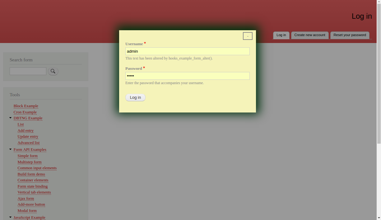
Login form
Subscribe form(News letter)
Webform and any other forms
Drupal blocks & Views blocks
Image popup & Slide shows
Social share & like
Recommended products & Related topics
Offer alert & Renewal alert
Cookies Notification
Features
Additional libraries not needed
Turn anything into popup
Most used 10 layouts
Three ways to trigger the popup
Popup based on page visit count
Optional overlay
Optional close button
Optional ESC key to close
Optional minimize button
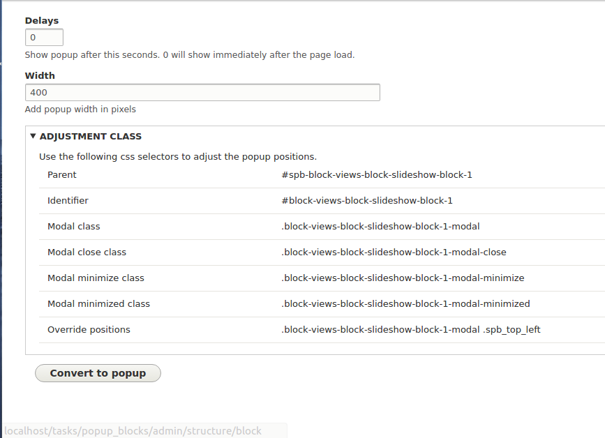
Adjustment classes to customize the design
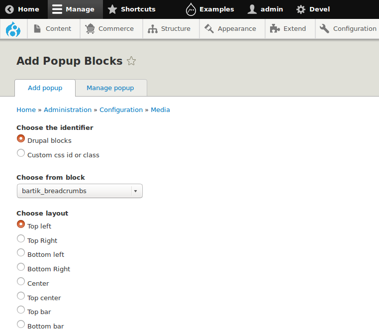
Layouts
- Top left
- Top Right
- Bottom left
- Bottom Right
- Center
- Top center
- Top bar
- Bottom bar
- Left bar
- Right bar
Popup Designs
This module will not add any default popup designs. You have to customize it by your requirement, It will provide CSS selectors on popup's edit page, with that you can extend the designs.
Note
Clear the caches once you cretaed the popup.
See attachments for more popups.