Overview
This module solves the problems with images and responsive themes, it allows you to define multiple image style suffixes and their corresponding maximum width.
The future (Drupal 8)
See [#1757518]: Since picture is now part of Drupal 8, we have backported that code to Drupal 7, picture 7.x-2.x
Warning
- Before upgrading Drupal 7.20, please read the release notes, since this will break this module. To fix it you need to add
$conf['image_allow_insecure_derivatives'] = TRUE;to your settings.php file. There's an issue trying to solve this [#1923936], but upgrading to the picture module will solve this as well. - Selecting _default as suffix might break your theme, safer is to always use __ (2 underscores) like __default.
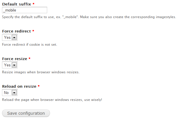
- Be care full if you use the force reload on resize option, it will generate more request to your server and might have a negative impact on your performance.
Features
- Full support for image fields
- Full support for colorbox
- Partial support for field_slideshow
- Doesn't need any changes to .htaccess / nginx
- Supports page caching per size
- Can do an automatic reload if the cookie isn't set
- Can do an automatic reload if the window size is changed
- Supports expire module, so the cache gets cleared for all defined suffixes
- Supports the Context Module
- Supports the Media Module
- Supports images within blocks (can be disabled on the settings page)
- Supports images within entity textfields (must be enabled in the settings of the field)
- Clone image styles for all defined suffixes
- Support Retina displays
Tutorial
Thanks to Brian there's now a 3 part video tutorial at Modules Unraveled.
Responsive images and the Media module
There are a few steps that need to be taken before this module plays nice with the Media module:
- Enable Responsive images and styles and the Media module
- Add some suffixes for responsive images (see 'Tutorials' further down)
- Create image styles according to these suffixes(see 'Tutorials' further down)
- Go to /admin/config/media/file-types/manage/image/file-display/media_responsive
- Check the checkbox next to 'Image'
- Select the image style with the default suffix as image style
- Save the settings
- Go to where you can manage the fields of your entity type (for node -> Basic Page that would be admin/structure/types/manage/page/fields)
- Click 'edit' next to the field where you want to insert responsive images (e.g. 'Body')
- At the bottom, check the checkbox 'Apply responsive images and styles to this field'
- Now, when you add a file to a field with the Media plugin for WYSIWYG, choose 'Responsive' as your format.
- Your images should resize as expected now.
Dependencies (7.x-2.x version only)
Breakpoints, make sure you read the documentation and order you breakpoints correctly.
Known problems
- If you enable 'Force resize' the module tries to resize everything, this works for plain images, but not for field_slideshow and some other jQuery slideshow like plugins.
- If you use barracuda/octopus (http://drupal.org/project/barracuda) you have to change the cache key, add $cookie_respimg to the fastcgi_cache_key directive inside nginx_advanced_include.conf
Tutorials
Look up the break points in your theme to see what values you have to use, this is just an example.
Install a responsive theme like omega and create the following image styles at /admin/config/media/image-styles
- thumbnail__mobile: width 100px;
- thumbnail__narrow: width 150px;
- thumbnail__normal: width 220px;
- thumbnail__wide: width 300px;
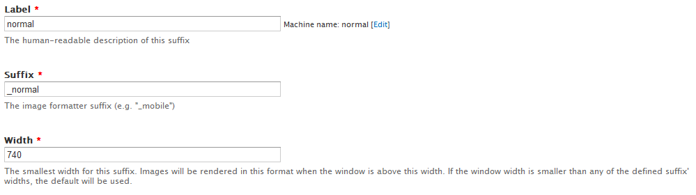
goto admin/config/media/resp_img and add the following
- add a suffix: __narrow - 500
- add a suffix: __normal - 720
- add a suffix: __wide - 900
goto admin/config/media/resp_img/settings and enter __mobile for the default suffix
Similar projects
- works as a field formatter
- only supports 2 sizes
- works with screen size, not window size
3/ Adaptive Image Styles (ais)
- needs .htaccess rules
- works as a field formatter
- works only on media field
- set as maximum width
- uses css for the smaller variants
7.x-2.x Version
This is a complete rewrite. This version doesn't use javascript anymore to detect the device width, but uses a picture tag and full media queries.
Upgrade from 1.x to 2.x
There now is an upgrade path from 1.x to 2.x.
To upgrade, follow these steps:
- Disable Responsible images and styles (do not uninstall) (you need to do this because we don't use the custom cache class in 2.x anymore. Related: [#1706596])
- Download Breakpoints, CTools and Field formatter settings.
- Enable Responsible images and styles again (along with its requirements Breakpoints, CTools and Field formatter settings).
- Go to /update.php and follow the steps.
- And you're done!
Dependencies
Features
- Image field support
- Colorbox support (only the rendered image, links to same destination).