Sector(s)
Team Members
Project Team
Donna Habersaat
NYU Steinhardt has much to offer students—and that was a problem for the school’s website. The site needed to give students a simpler, less overwhelming introduction to the university, while still providing a comprehensive picture of all the school has to offer.
The breadth of available programs at NYU Steinhardt is impressive, but it presented a problem for the school’s website. Over the years, various departments and administrative units had developed their own online look-and-feel and maintained multiple sites. This approach complicated the user experience and made it difficult for prospective students to locate the programs that interested them. This issue became more apparent to the school’s web development team—and its administration—in the wake of efforts to build a responsive layout with standardized elements and to make all the templates digitally accessible. As part of those projects, the team grappled with the reality that each department—and the various sites that formed NYU Steinhardt’s online experience—used different layouts, navigation, and headers. The school needed to convey the variety of its program offerings, as well as provide necessary information for faculty, staff, and alumni. But it needed to do so in a consistent way—one that would help improve the experience for students making a significant and challenging decision.
About the project
The breadth of available programs at NYU Steinhardt is impressive, but it presented a problem for the school’s website. Over the years, various departments and administrative units had developed their own online look-and-feel and maintained multiple sites. This approach complicated the user experience and made it difficult for prospective students to locate the programs that interested them. This issue became more apparent to the school’s web development team—and its administration—in the wake of efforts to build a responsive layout with standardized elements and to make all the templates digitally accessible. As part of those projects, the team grappled with the reality that each department—and the various sites that formed NYU Steinhardt’s online experience—used different layouts, navigation, and headers. The school needed to convey the variety of its program offerings, as well as provide necessary information for faculty, staff, and alumni. But it needed to do so in a consistent way—one that would help improve the experience for students making a significant and challenging decision.
The Solutions
The solution was to consolidate the university’s multiple sites and experiences into one cohesive, engaging user experience. The NYU Steinhardt team worked with Four Kitchens to determine the site’s primary users and to establish needs and goals for each of those personas. The Web Chefs also helped the NYU Steinhardt team develop standardized templates and components to ease the content creation process and provide a consistent, site-wide look-and-feel.
User Discovery and Persona Development
We began with the site’s star users: prospective students.
- How many degrees did they sign up to get more information for, and how many of those were in separate departments?
- How did they navigate between degree offerings and departments?
- How many of those who completed an application had visited or requested information from programs in other departments?
Site visitors were allowed to request information from up to three degree programs. The team learned that more than 15% of all inquiries requested information on more than one program and a third of those prospects expressed interest in programs from multiple departments. Another discovery: Many students’ first priority was information about tuition and the admissions process, even before they looked at which degrees were available.
Aside from prospective students, primary users included current students, alumni, faculty, and staff—all of who needed information about university deadlines, campus news and events, research, employment opportunities, and so on.
We concluded that a navigation built around degrees and programs, rather than departments, would help prospective students find the information they needed. A clearer path to admission information—including forms, requirements, and deadlines—would further improve the user experience for prospects. Research is a major focus for the university, so unifying research-related topics would strengthen its impact. And top-level navigation for current students, alumni, and faculty and staff would help those users find what they needed without needing to bounce between departmental sites.
Content Audit and Strategy
The next step was a content audit. Out of 15,000 site pages, the team narrowed its focus to 5,000, looking for the elements each program or degree needed and where there was flexibility to change.
We quickly determined that the school’s home page and program listings were both important starting points for student discovery. Each needed clear and cohesive yet unique structures. And information about campus life, research, employment, and so on needed to be honed down to ensure that other users could easily find what they needed, without the site turning into an online filing cabinet.
The home page would organize general content as well as lead visitors to better understand the school’s name:
- Culture and the arts
- Education
- Human development
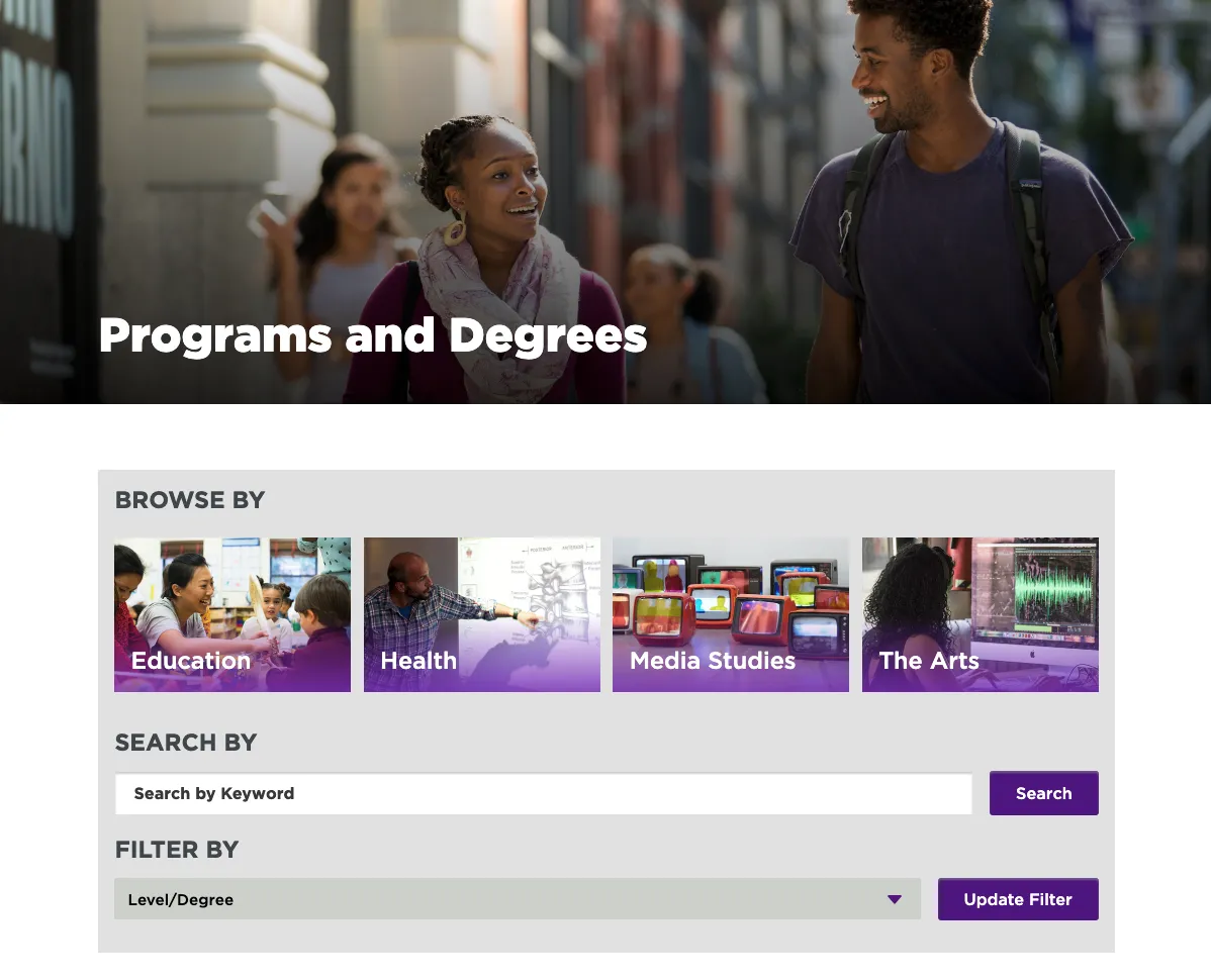
The Programs and Degrees page would provide a Search function as well as a comprehensive list of available programs, while also making it easier to filter on specific areas:
- Education
- Health
- Media studies
- The Arts
- Level or Degree
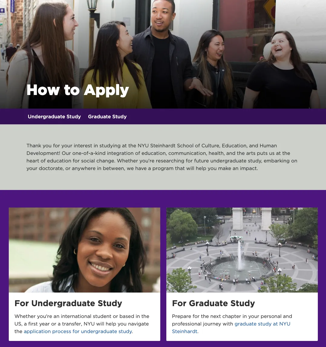
We also developed a program-level strategy to identify the content that each Program or Degree page should include (with additional flexibility for programs and degrees with special needs):
- Available degrees and degree-specific details
- Research
- Student Experience
- Faculty
- Alumni in Action
- Applications and information-request forms
Sample text was then created to provide the university’s many stakeholders with guidelines on how to create concise, engaging, and consistent content. The NYU Steinhardt team provided content-creation assignments and requests to stakeholders.
Component and Template Design
With a clear understanding of the site’s audience and how to help each type of visitor navigate their journey, it was time to create the site templates.
The NYU Steinhardt team knew that they wanted to center the site’s design around components that could provide both consistency and variety. They worked with our team to develop a pattern library of components, each with a clear, specific use. Colors, headings, and other visual components were chosen to help guide visitors while still allowing each program and department to express itself in unique ways.
Next, we designed templates of key pages. These templates included:
- Required components
- Optional components, such as photos and alumni quotes
- Recommended character counts
- Information limitations
Optional content blocks were also included, to enable greater variety by linking to other pages or assets.
The Results
The NYU Steinhardt website now provides a clear course for prospective students to choose—and apply for—degree programs. The team is engaged in standard post-launch work:
- Addressing questions from internal stakeholders who are getting used to new navigation
- Smoothing out design and making notes of desired future adjustments
- Modifying content-creation processes to incorporate lessons learned during the launch
- Planning next steps and future phases, including template revisions based on the final design
In the first five months after launch the NYU Steinhardt team saw increases in desired actions and desired engagement. Compared to the same time period last year we’re seeing increases in desired user actions and behavior:
Desired Actions:
- 25% increase in prospective student inquiry form submissions
- 15% increase in started applications
Desired Behavior:
- 7% increase in the average time on page
- 10% increase in the average pages per session
- 22% increase in the average session duration
Additionally, the team has already seen attention within the school shift to focus on end users rather than department-centric teams—a change that is sure to improve the user experience for prospective students.
Why Drupal was chosen
Drupal's component design and templating capabilities were crucial in developing an improved user experience.

Technical Specifications
Drupal version: