Sector(s)
Team Members
Project Team
Team Members and Roles on the Project:
- Dan Moriarty – Creative Lead, Planning and Discovery, UX and UI design
- Tim Broeker – Technical Lead, Backend Development, DevOps
- Adam Fuchs– Site Build Lead, Frontend Development, Theming, Site Building
- Aundrea Billings – Project Management, QA, Training
- Oz Heller– Migration, Backend Development
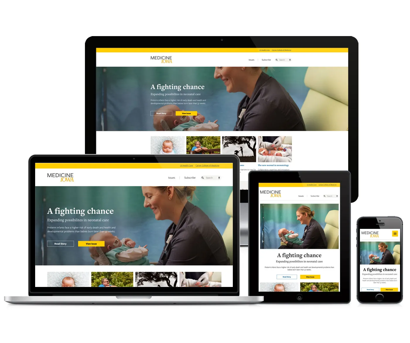
Medicine Iowa is a twice-yearly publication by the University of Iowa. The magazine is sent to alumni of the Carver College of Medicine, as well as every practicing doctor in the state of Iowa.
While the print publication is well regarded and read, the online version of the magazine was sorely lacking. Electric Citizen was engaged to partner with marketing and communications at the Carver College of Medicine to plan, design and build a new online home for the magazine.
About the project
Goals and Requirements
We began the process by reviewing the client's initial discovery work, and defining stakeholders, desired outcomes, and measures of success.
Our primary initiative was to better tell the story of the College of Medicine, promoting both school and alumni research and achievements to a wider audience.
The new site also needed to better reflect University branding, and present content in a more engaging and effective manner. The site content itself was often short summaries of text which simply linked to other websites, but the new goal was to make this site more of a content hub for visitors, and closer to the same content found in the printed magazine.
Finally, we needed to provide site editors with a better set of tools for managing articles and issues of the magazine, and generating the type of engaging layout that would keep visitors coming back for more.
Solutions
The print magazine for Medicine Iowa has a certain aesthetic that wasn't being translated to the website. Of course the printed page is different from a webpage, but there were many elements that could be duplicated or reimagined for the web. We wanted to bring these two properties closer together.
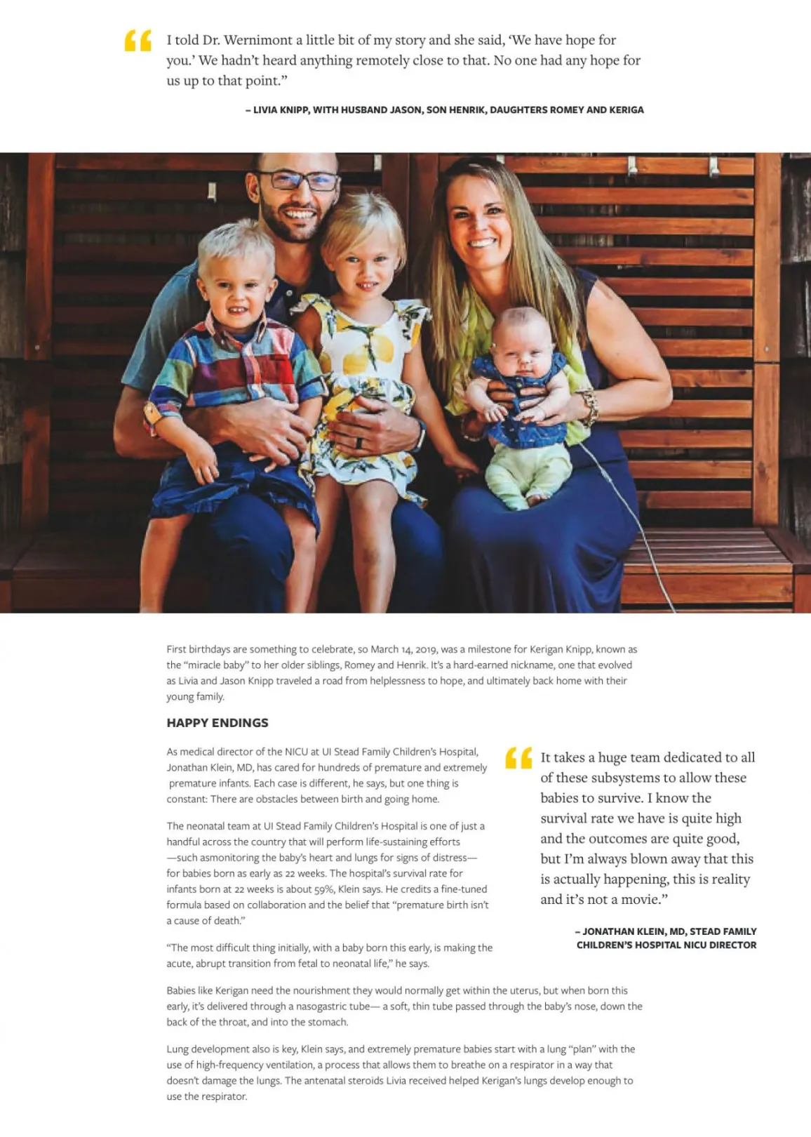
This meant duplicating some printed features, like large engaging photographs, use of pull quotes and statistics, and callouts which break lengthy articles into sections for easier and more engaging reading.
The University of Iowa brand was missing as well. We looked for ways to implement common fonts and colors, while not overwhelming the articles with black and gold. The University is undergoing a branding refresh, and the new site needed to fit with the new direction, and feel part of the overall family of websites.
Improved User Experience
Reading a magazine online is a different experience than reading one in print. There are different considerations when displaying articles online, and tools that simply don't exist for the printed magazine. But that doesn't mean we wanted it to feel unfamiliar to the user.
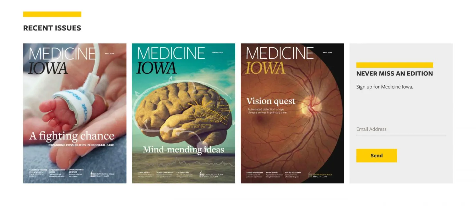
The new homepage leads with a large featured article, much like the cover of a magazine. Just a teaser of a title and summary, along with an engaging image, to draw readers in. Clear call to action buttons are visible. We opted to also include some additional article summaries here, showcasing some of the most compelling content currently available. Though these are typically from the current issue, we built in flexibility for site editors to select a variety of content, should they wish to highlight something else for a time.
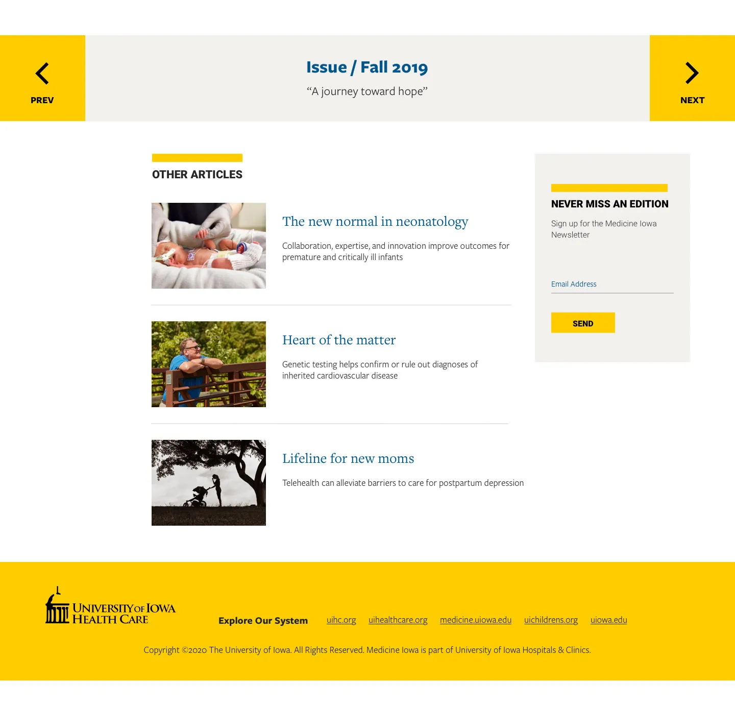
The site navigation was greatly simplified, down to just a few essential links – Issues and Subscribe. Previous issues are easily accessible through the "Issues" link. As the collection of issues grows, we included filters to allow users to locate content by keywords or issue "themes."
Each issue has a dedicated landing page, where users can review a list of featured content, as well as a detailed table of contents to capture all issue content. Once an article is read, users have multiple options–they can opt to use an onscreen pager to simply click to the next article, use a Table of Contents for the current issue to select another article, or click on related content, assuming editors tag an article to show additional content.
Responsive and Accessible Design
Following our work on strategy and user experience, we moved to the visual redesign. We began by presenting a new family of design components and refining results based on feedback before moving into a series of mobile and desktop page mockups.
We were inspired by designs that emphasized long-form article content. This meant clear, legible typography that was easy for users to scan and read. Large featured images (or video) helps to draw users into an article, while a series of stylized content can be dropped onto the page by non-technical editors, to break content apart and make it more visually compelling.
The overall aesthetic is minimal, with a white background, black type, and occasional accents of color. While the primary branding colors are black and gold, the secondary color palette was in flux. We explored some different options, including a vibrant teal, before settling on shades of blue and light beige.
Editorial Experience
Relying on the Paragraphs module, we introduced a series of "widgets" which let editors easily drop in a variety of content into articles. These include accordions to show/hide content with a simple click, pull quotes for large callouts, stats widgets for displaying large numbers or statistics, embedded videos or full image galleries.
These tools let editors create and manage engaging articles and landing pages, and get closer to duplicating a great magazine experience online.
The finished website also features Electric Citizen's custom admin theme, featuring content moderation dashboards and improvements to the admin UI. We're always looking for ways to improve user experience for both end users and site editors.
Outcomes
The University was in the process of hiring and training new web developers for their internal team. As part of our work, our developers met regularly with the Iowa developers, demonstrating how we made decisions around the site build, and transferring knowledge where and when we could.
Post-launch the clients team was able to take over maintenance of the site, and adding site improvements or edits as needed. We're always happy to offer ongoing support where needed, but helping a client move towards managing their own site is a great outcome!
Why Drupal was chosen
The Carver College of Medicine had recently moved their primary website to Drupal, and was seeking a vendor to migrate the Medicine Iowa website to Drupal as well. The University of Iowa moved to Drupal for many of the same reasons numerous other universities–a secure, stable, and flexible platform that can be customized to the needs of higher education.
Drupal offered editors a powerful yet easy-to-use content management system, where editors could construct attractive, magazine-style articles with little technical knowledge required.
Technical Specifications
Drupal version:
Key modules/theme/distribution used: