Sector(s)
Team Members
Project Team
Annertech is Ireland’s leading open-source digital agency. Founded in 2008, we have grown to become the "go to" Drupal experts in Ireland and work with a range of clients in both the private and public sectors.
Our mission is to help companies to embrace open-source technology to deliver ambitious digital experiences for their customers. Our philosophy is to never hoard our knowledge, but share it – with clients, partners and the open-source community.
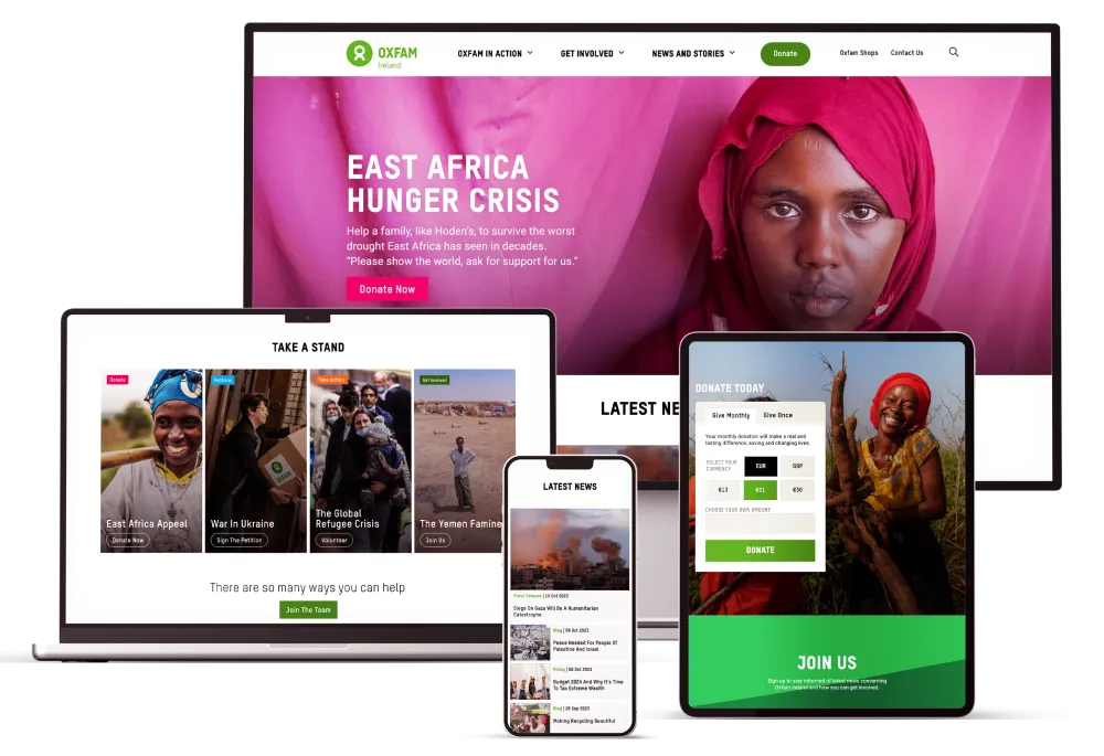
Our clients include: Glanbia, Limerick City and County Council, Oxfam Ireland and Bóthar.
Visit www.annertech.com for more information
Visit the site
Visit the siteOrganizations Involved
Community contributions
Commerce Donate 8.x
We ported the Commerce Donate module to Drupal 8. While it works very well for us, a few items (such as donation amounts) are hardcoded and need to be made configurable before we will release a stable version.
Commerce Realex / Global Payments 8.x
We created a Drupal 8 version of the Commerce Realex / Global Payments payment gateway module. Hosted-Payment Pages (HPP) work but other features such as Realex Remote have not been added yet.
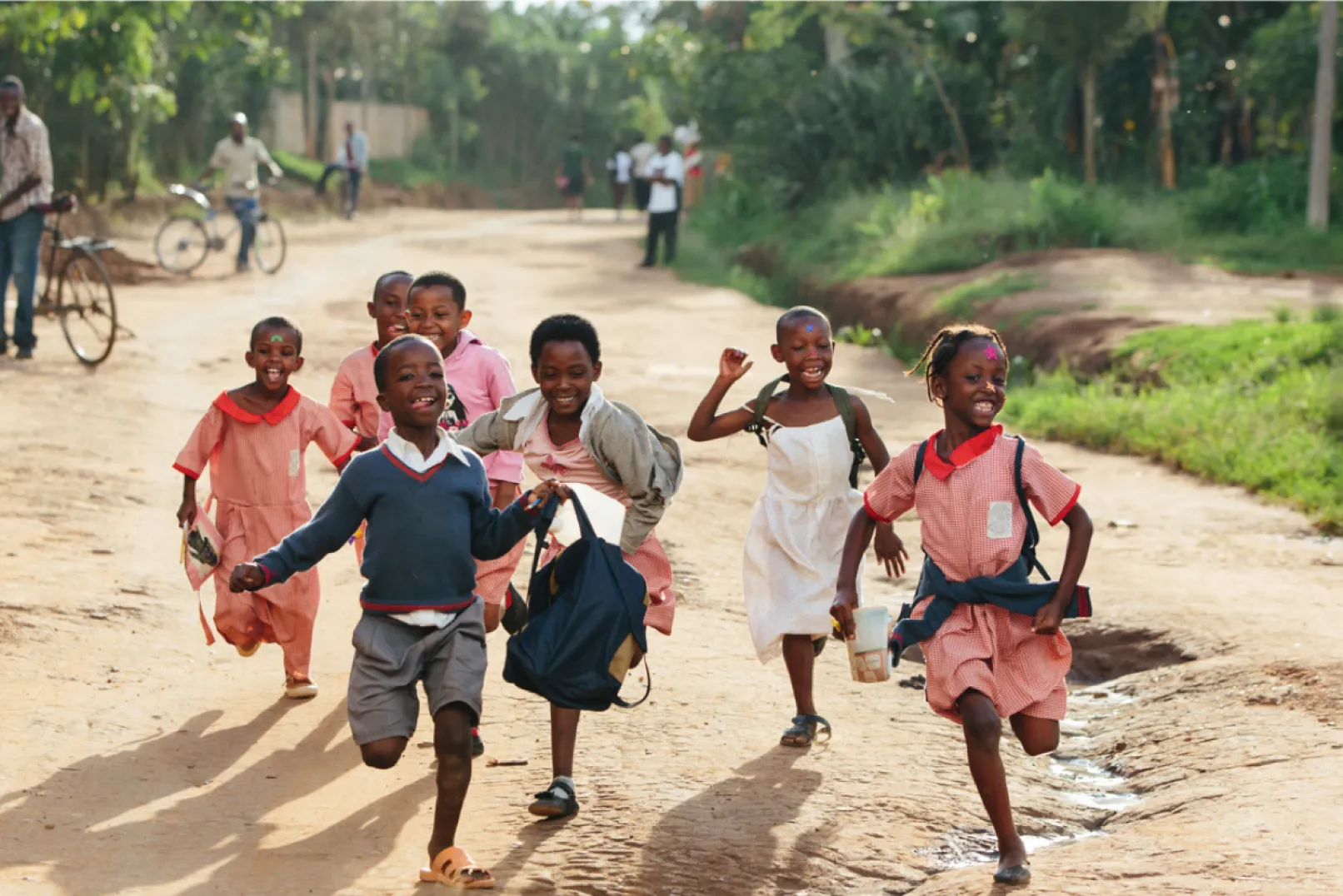
Bóthar have a trustworthy reputation for taking action on international aid that provides poverty-stricken families with the means to solve their problems, permanently. They help ensure families overcome hunger, malnutrition and poverty in a simple sustainable manner by donating animals, trees, bio gas and water systems to families throughout the world.
They also accept donations online and purchase these life-saving gifts and transport them to the communities in need. Bóthar provides training and education to the families on how to make a business from their gifts and become self-sufficient.
About the project
From the outset, we noted that there were significant UX issues on the website particularly within the donation flow - the primary funding source the charity relies on to help communities in need.
Project requirements:
- To conduct user research to discover the user’s needs, frustrations and motivations.
- To design an online shop to increase sales of sustainable gifts
- To create a simple and easy donation flow to reduce complaints via phone calls to the organisations.
- To facilitate monthly donations.
- To inform new users about the charity and promote Bóthar’s identity, story and mission to encourage and facilitate sustainable development projects in struggling communities throughout the world.
- To educate teachers and students in Ireland who would visit the website for educational resources for school.
Strategy/Discovery
Bóthar’s aim for the project was to increase visitor engagement, improve the user experience and to increase donations on the website. Their previous strategy had been quite traditional in advertising using TV and radio ad campaigns and they wanted to expand their digital presence and improve the user experience on the website. As part of this strategy, we guided Bóthar on a huge content review of imagery, video and copy needed to communicate their mission and values in an impactful and meaningful way.
The majority of their users were donors aged between 45-65 and older. Happy donors want to be inspired to donate, not guilt-driven to donate. They want to be able to add value to the charity and know the scale of their contributions and impact it has on the world.
The personas of the current users also highlighted the need for improved web accessibility, an optimised information architecture and simple universal language to help guide the user on their journeys. The aim of the website is also to encourage a younger audience to feel inspired by the stories to help donate, see a happy/positive outcome and be part of a success story.
We conducted research by using a survey and having interviews with the website users to find out what their needs, motivations and frustrations were when visiting the website. By carrying out usability testing and reviewing their current analytics, we could see it was taking longer than expected for people to carry out a simple task online, such as make a donation.This task resulted in people getting frustrated and resorting to calling the organisation to make a donation when they encountered issues on the donation form.
Other research insights included:
- The website was difficult to navigate - which affected the engagement and interaction rates on the site.
- Hard to make a decision on what gifts to donate. People did not know the benefits of donating the animal.
- Very text heavy – it was difficult for the user to understand what Bóthar were trying to communicate.
- The back button on the payments section took the user out of the website. This resulted in lots of people dropping off the website and not returning due to a bad experience.
- The currency's values didn't match up with what your donation would buy on the supporters draw section .ie the sterling values were the same as it was in euro. This impacted the user’s living in the UK and the exchange value of their currency which also had an impact on purchases on the website.
- Couldn't see whether Paypal could be used or not without putting in a lot of personal information first.
- Gift choices could be improved. Maybe a bit intimidating for people not so au fait with websites.
- Wants gift options for various prices under €50 and to be able to purchase multiples for family at Christmas time.
- Difficult to see where the educational resources are on the site.
Innovation
We reviewed the website holistically and examined the major pain points experienced by the visitors. We noted that someone new to the website needed to know and understand what Bóthar did, where they worked globally and why they do what they do. Pages dedicated to this information were considered in the redesign of the website.
Accessibility was a major priority when designing the website to ensure we were providing an enjoyable experience for people with disabilities, learning difficulties and power users. Through the use of colour contrast on call to actions, hover states, icons to accompany titles, clear labels on forms, use of correct markup and supporting keyboard navigation for people with motor disabilities and blind people that rely on screen readers.
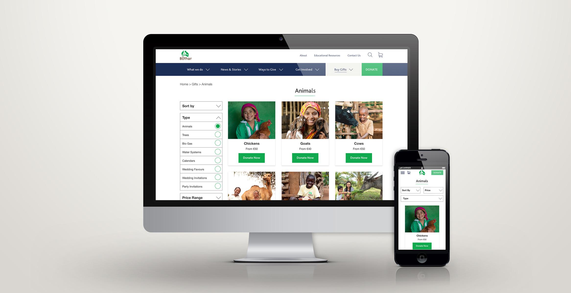
For new users and current users, the online shop to purchase gifts and the donation form needed to be optimised, particularly for mobile. The shop did not have any structure to it and items were incorrectly categorised. From user research, we were able to determine what topic filters were most important to the users. The users wanted the ability to find gifts to buy using a price range, sort by highest to lowest and gift type. This allowed the user to find the gifts that were affordable to them quickly.
Opportunities for donating were available throughout the website on pages that told the story of how Bóthar are helping struggling communities to become sustainable. Bóthar responds to countries in crisis so we designed a dedicated campaign banner area that prompted the visitor to get involved and donate from the Appeal pages and the Home page. A donate form is placed in various places throughout the site so the user can choose their donation amount quickly and easily.
From the user research, we also noted that the users were not clear on how a particular animal would be of benefit to an underdeveloped community. The product detail page was targeted as the best opportunity to convey the benefits in a simple and easy to understand way. This information was written in a persuasive and factual way to help encourage the users to purchase the gift for those in need. The user also had the freedom to collapse this information to shorten the scroll of the page if they wished. To encourage increases in gift sales, accessible and large quantity buttons were designed to allow the user to easily increase the gift quantity.
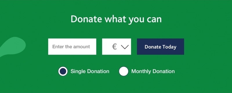
A currency toggle was designed for the donation and gift pages to help users who wanted to donate in Sterling or Euro. The amounts were also converted to reflect the exchange rates. We integrated with Paypal to give the users another payment option that was quick and easy to use for completing their donation.
At every stage in the donations flow the user also has an option to call the charity to make a donation if they prefer this method of donating. However, the organisation has noted a huge decrease in calls and increase in donations made via the website.
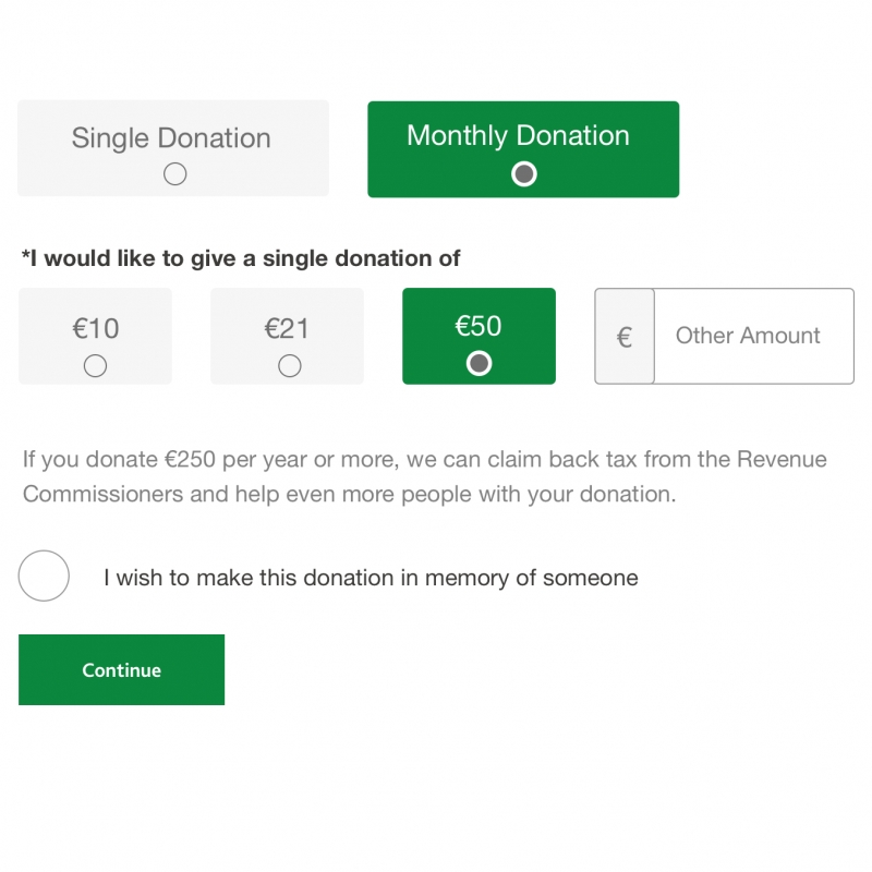
Image and video curation was a huge consideration in the redesign. The imagery, in particular for the Gifts page, were selected to communicate the benefits of the animal or gift on the families that received them. Studies[1 & 2] have shown that displaying positive impact imagery (‘positive empathy marketing’) has more effect on motivating and persuading the user to donate to charities compared to sad and negative impact imagery where the user may feel a negative emotion and feel guilty and therefore does not donate.
Since the idea is to create human-centred marketing, the use of people (showing the organisation’s staff, volunteers and beneficiaries) making a difference acts as a link of connection and creates a relationship with every audience.
Meeting the challenges
The evolution of the donor experience is grounded in our vision to reinvent the charity and make it appeal to a wider audience. The question was, ‘how do we design the donor experience so that it inspires generosity and engagement?’
On the donation landing page, it was challenging to communicate in a small area how meaningful the donation amount was to people when deciding what amount to give. The highlighted gifts are chosen based on the community's needs and it is a guide to inspire and help the donor make a decision about what amount they wish to give.
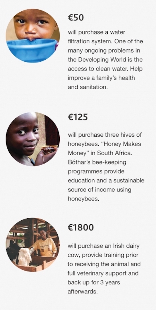 ‘What will your gift do?’ area highlights 3 amounts showing an image of the positive impact their money will have the communities receiving gift and a short description. These amounts and images can be edited by the internal digital team as the appeals for certain sustainable gifts change within communities.
We noted from research that there were inconsistent imagery of the animals and other gifts such as water filtration systems depicted using various illustrations and some using real photography. This had an impact on the donor’s perception of the ‘real’ effect an animal or water filtration system would achieve based upon the style of imagery used. The illustrations looked ‘friendly’ however for the donor did not have an accurate or more realistic visual representation of what that gift would achieve. All gifts were represented using actual genuine photographs taken in the communities of the animals, plants, water or gas systems in use. This has had a positive impact on donations and donors.
Monthly donations were problematic for the user. Prior to the redesign of the website, Bóthar were struggling to have any monthly direct debit donations. The users only had the option to call the charity to make a monthly donation. This process involved many pain points from filling out a form that would be emailed or posted to them and the form would need to emailed or posted back to the charity and then the bank would need to complete a separate form to set up the direct debit. This zig-zag approach risked the user getting frustrated and not completing the task in the end. In the new design, we cater for a more effective streamlined monthly donation flow. The user can input their information required by Bóthar and the bank to process the payment. This has significantly increased in monthly donations to the charity enabling them to help more communities in need.
Results
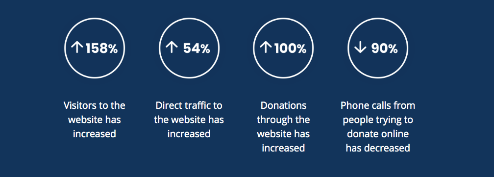
Some trends are becoming visible which indicate that the site's performance from a UX perspective appear to be making a positive impact.
- 158% increase in website visitors
- 54% increase in direct traffic
- 100% increase in donations through the website
- 90% reduction in helpdesk calls from people trying to donate online
Why Drupal was chosen
Bóthar’s existing website was developed on a proprietary CMS that was difficult to administer and required heavy reliance on their provider to make changes. Drupal was selected due to its flexible nature, its robust security features and the support of the international community.
Technical Specifications
Drupal version:
Key modules/theme/distribution used:
Paragraphs
Using the paragraphs module, content editors were able to create and build their desired page structure. It gives editors complete control over the layout of their content by choosing a pre-defined set of paragraph types, all the while not deviating from or breaking the design.
Media modules
The media suite of modules enabled content editors to add and re-use imagery, videos and downloads across the site. Editors can upload new media items or choose from ones already uploaded through the media library.
Commerce
The Commerce suite of modules is used to drive both the shop and the donation forms on the website. Through the use of the Commerce Currency Resolver module we were able to provide a currency switcher.
Commerce Donate
The Commerce Donate module was used to drive all donation forms on the website, as well as add an in-checkout donation pane to the checkout page.